Google Unveils First Major 'G' Icon Redesign in a Decade
Google’s Iconic ‘G’ Gets a Makeover: What You Need to Know
Introduction
If you’ve opened your Google Search app recently, you might have noticed something different. After almost 10 years, Google has quietly rolled out a brand-new look for its iconic "G" logo. This subtle yet significant change is more than just a fresh coat of paint-it reflects Google’s ongoing evolution in the digital world. Let’s dive into what’s new, why it matters, and how it fits into Google’s broader branding journey.
What’s New with Google’s ‘G’ Icon?
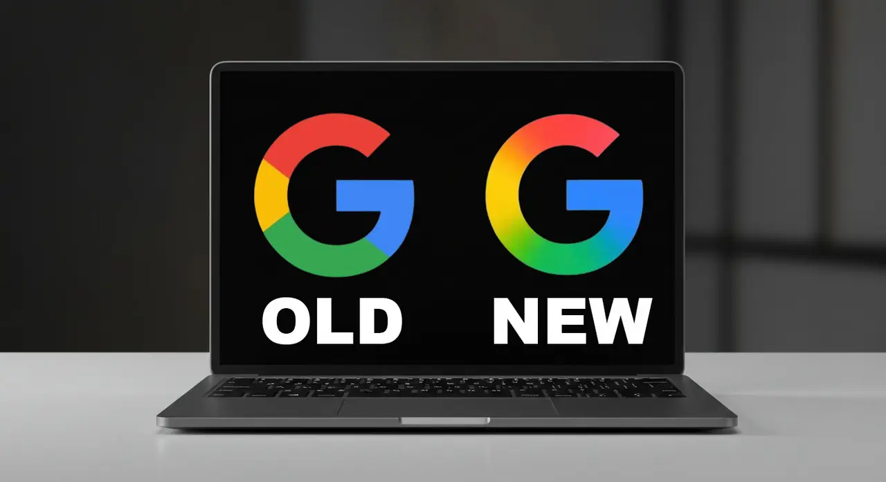
On May 12, 2025, Google began introducing its first major update to the “G” icon since 2015. The familiar four-color blocks that formed the letter have now been replaced with a smooth, modern gradient that seamlessly blends Google’s signature blue, red, yellow, and green hues.
Where Can You See the New Icon?
The updated “G” is currently live on the Google Search app for iOS.
Android users can spot it in the 16.18 (beta) update.
As of now, other Google products and services still feature the previous version.
This redesign comes just days before the highly anticipated Google I/O 2025 developer conference, sparking speculation about more branding updates on the horizon.
Why Did Google Change Its Icon Now?
Branding isn’t just about looking good-it’s about staying relevant and resonating with users across platforms and devices. Google’s last major logo refresh was in 2015, when the company introduced the color-block “G” alongside a new typeface called Product Sans.
Back then, Google explained the change as a way to adapt their brand for a world where people interact with technology across countless devices-not just desktop browsers. The new gradient design continues this trend, signaling Google’s commitment to a modern, unified visual identity.
Key Reasons for the Update:
Modern Aesthetic: Gradients are a popular design trend, offering depth and vibrancy.
Cross-Platform Consistency: The new look is optimized for today’s diverse digital landscape, from smartphones to smartwatches.
Brand Evolution: Google’s visual identity evolves alongside its technology and user experiences.
A Brief History of Google’s Logo Evolution
Google’s logo has seen several transformations since the company’s founding. Each change reflects shifts in technology, design trends, and user behavior.
1. The Early Days: Serif Simplicity
The original Google logo, designed by Ruth Kedar, used a serif font that balanced tradition with a forward-looking feel. It was playful yet professional, setting the tone for Google’s brand personality.
2. The 2015 Overhaul: Product Sans & Color Blocks
In September 2015, Google introduced a major update:
Typeface: Switched to Product Sans, a clean, geometric font.
Icon: The lowercase “g” on a blue background was replaced by the now-familiar four-color “G.”
Purpose: To create a brand identity that worked seamlessly across all devices and input types.
As Google stated in its 2015 announcement:
“We’ve taken the Google logo and branding, which were originally built for a single desktop browser page, and updated them for a world of seamless computing across an endless number of devices and different kinds of inputs.”
3. The 2025 Refresh: The Gradient Era
Now, in 2025, the gradient “G” marks a new chapter. It’s subtle, but it reflects how digital design has evolved-favoring dynamic, layered visuals that feel alive on any screen.
The Impact: More Than Just a Logo
While a logo update might seem minor, these changes can have a big impact on how users perceive a brand. Google’s “G” is instantly recognizable worldwide, and tweaking it is a signal that the company is always moving forward.
What Does This Mean for Users?
Fresh Experience: The new icon feels more modern and engaging.
Consistency: Expect a more unified look across Google’s ecosystem as the new design rolls out to other apps and services.
Brand Trust: Regular updates show that Google is attentive to detail and committed to staying current.
What’s Next? Looking Ahead to Google I/O 2025
The timing of this redesign is no coincidence. With Google I/O 2025 just around the corner, many are wondering if this is just the beginning of a broader visual refresh. Could we see new icons, updated interfaces, or even more ambitious changes to Google’s branding?
While Google hasn’t confirmed any additional updates, the company’s history suggests that major events like I/O are often used to unveil new features and design directions.
How to Spot the New ‘G’ Icon
Curious to see the new look for yourself? Here’s how:
iOS Users: Update your Google Search app via the App Store.
Android Users: Join the beta program or wait for the 16.18 update to roll out.
Other Platforms: Keep an eye out-Google may expand the new icon to more products soon.
Why Logo Updates Matter in the Digital Age
In today’s fast-paced world, a brand’s visual identity needs to do more than just look good. It must:
Adapt to new technologies: From mobile to wearables, logos must be versatile.
Reflect current trends: Gradients, minimalism, and dynamic visuals are in.
Maintain recognizability: Even as designs evolve, the core elements must remain familiar.
Google’s new “G” strikes this balance, blending innovation with tradition.
Final Thoughts: A Small Change with Big Significance
Google’s refreshed “G” icon may seem like a minor tweak, but it’s a powerful reminder of how even the world’s biggest brands must evolve to stay relevant. As we look forward to Google I/O 2025 and beyond, expect more updates that reflect not just where technology is headed, but how we interact with it every day.
Stay tuned-Google’s next chapter is just beginning.
If you want to stay ahead of the curve with the latest in tech branding and design, keep following our updates!